Buffet

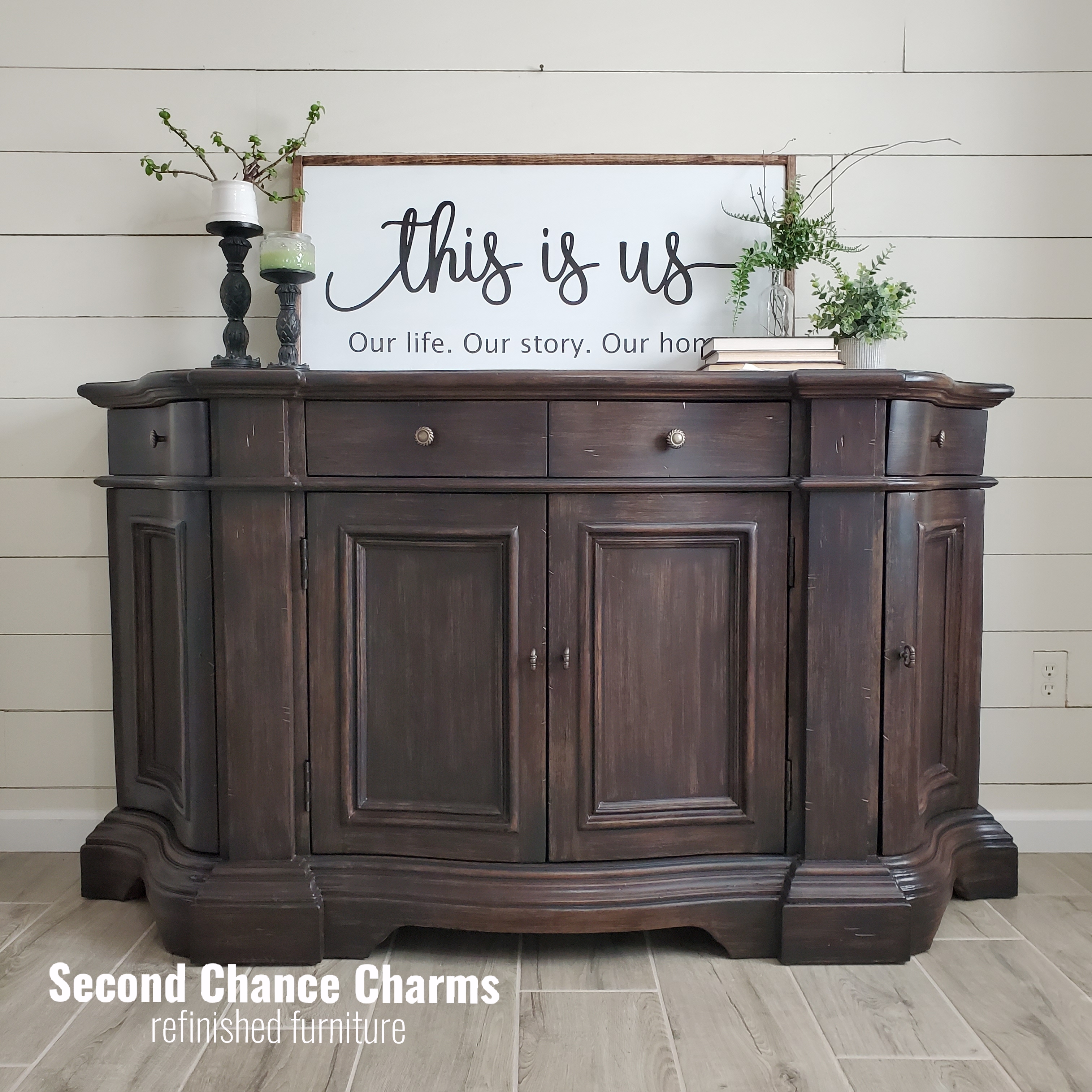
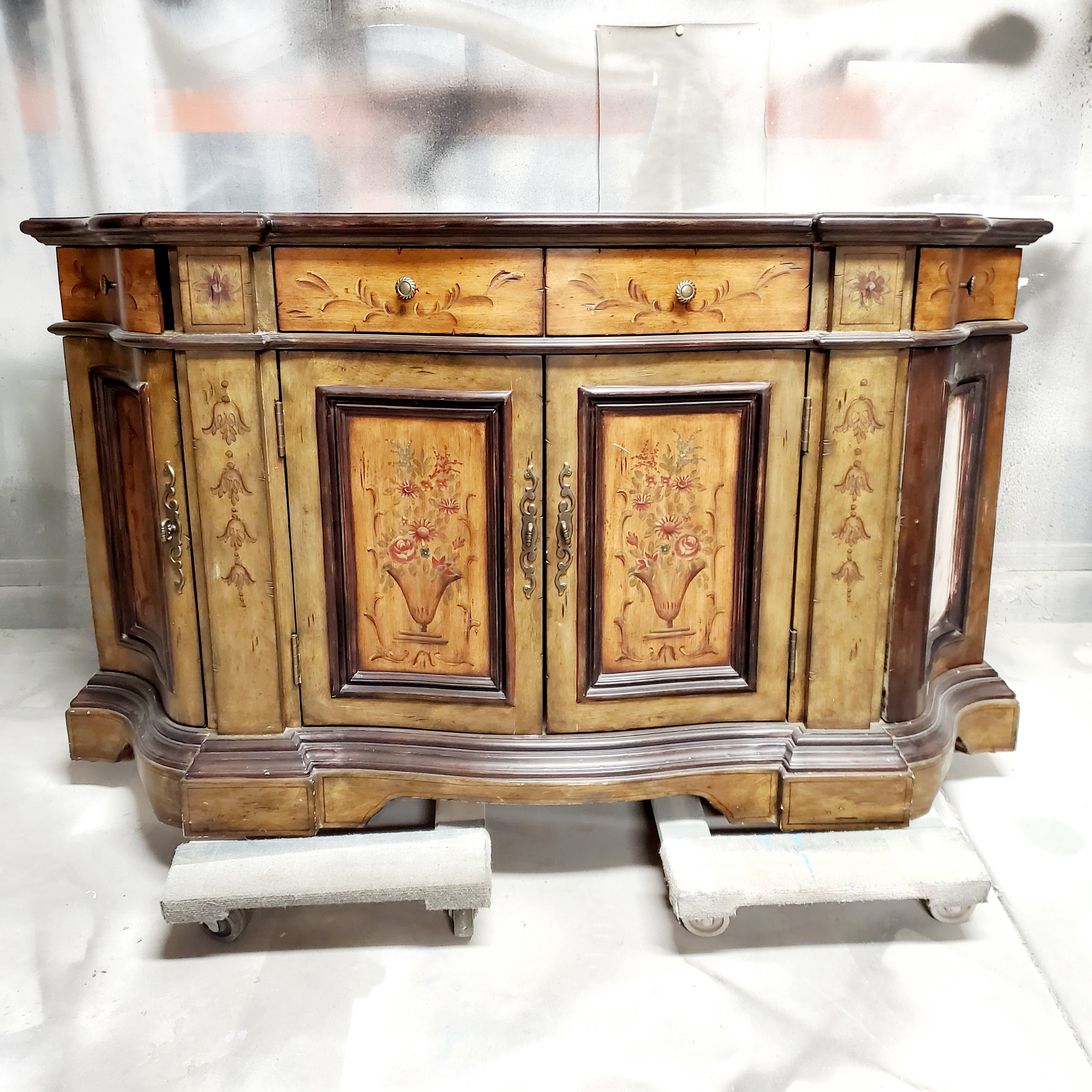
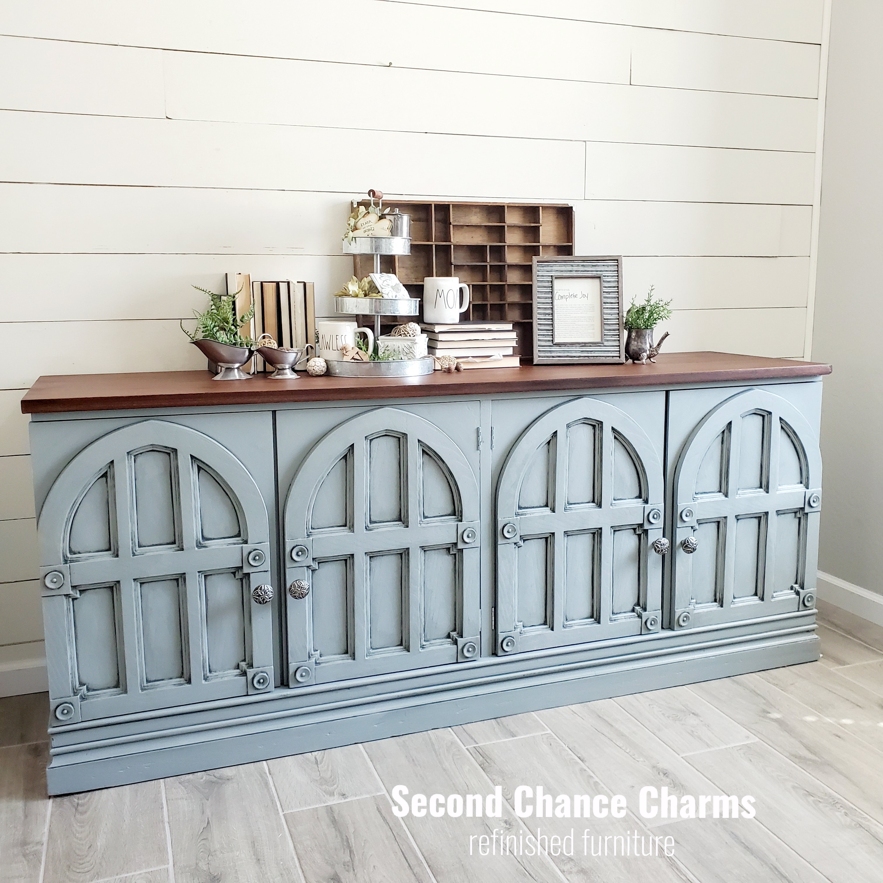
“Oh my gosh! It’s so beautiful. I can’t believe I contemplated getting rid of it and buying a new piece for my space.”

Really in love with this gal! My client had a vision and although she didn’t quite push me out of my comfort zone, I found a challenge worth the reward.

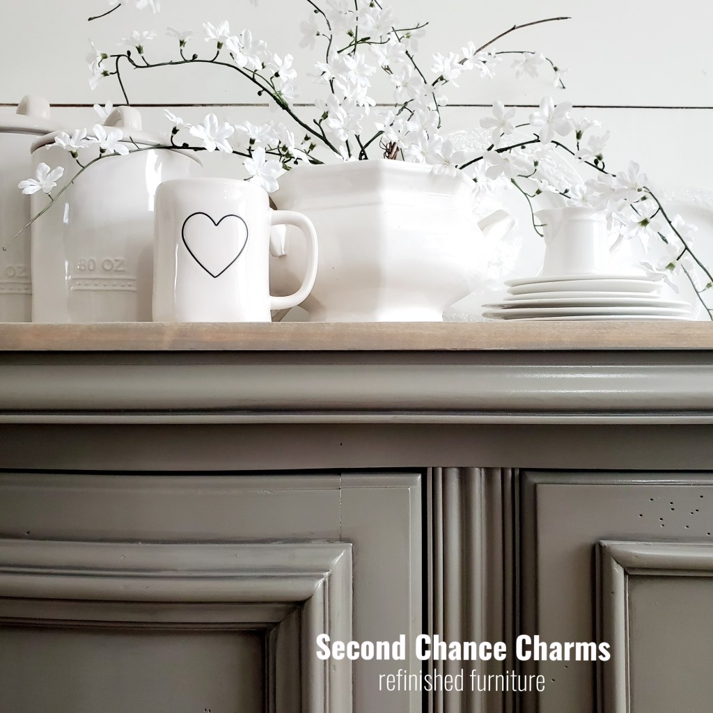
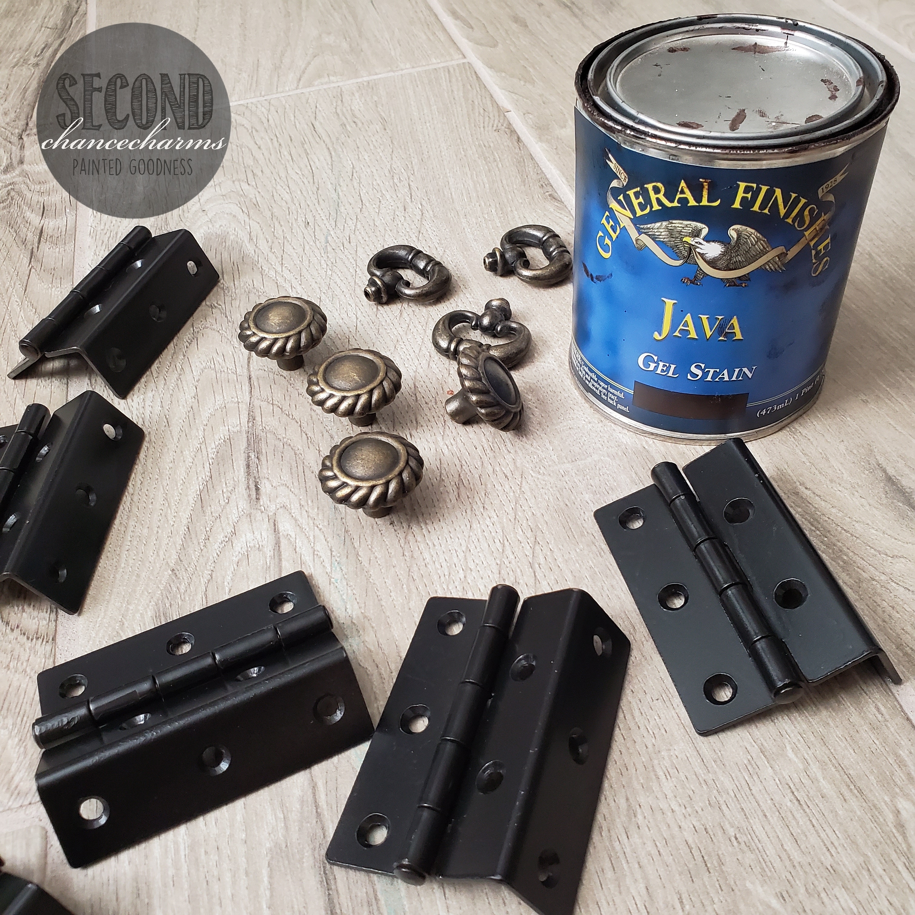
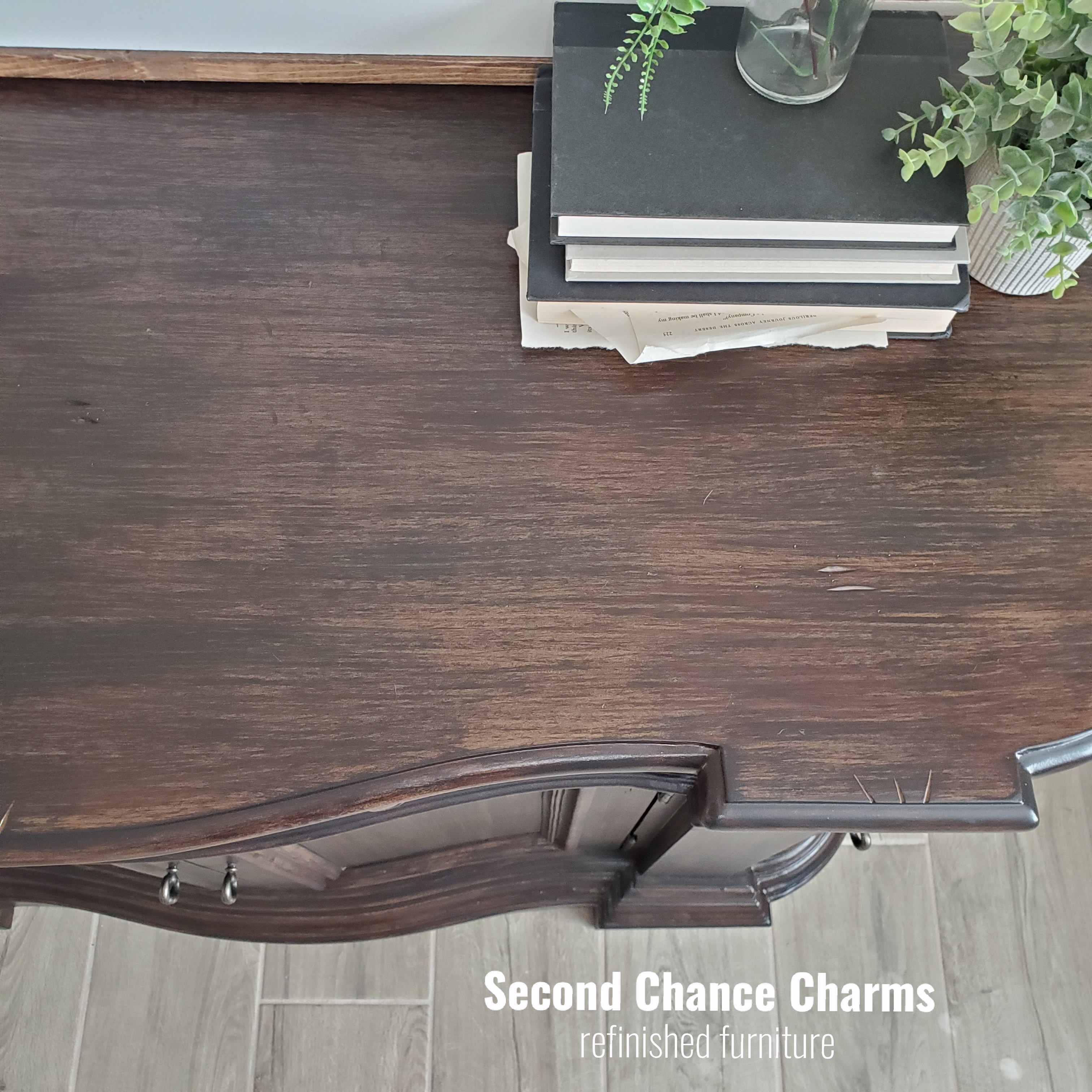
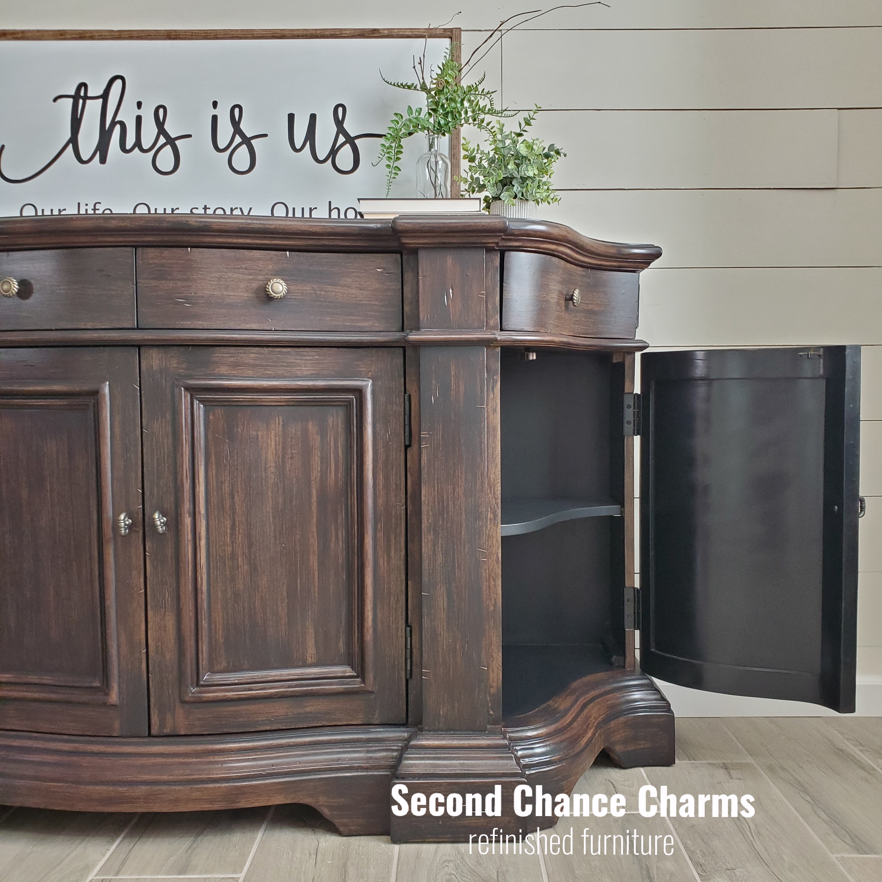
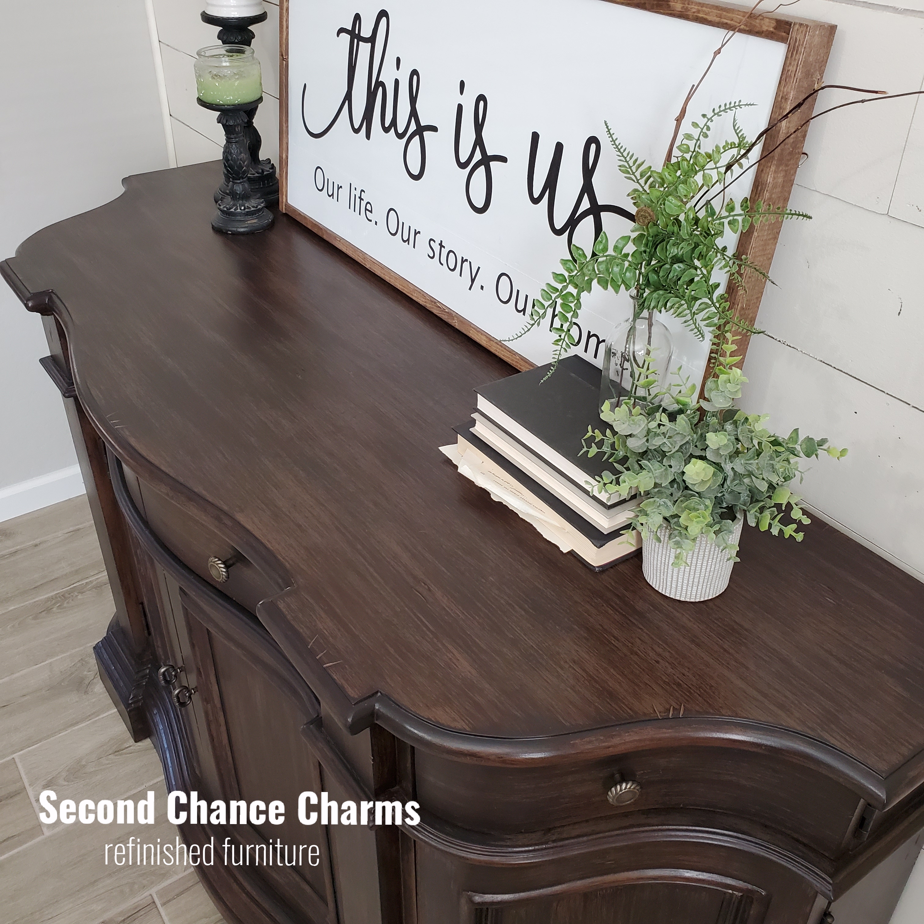
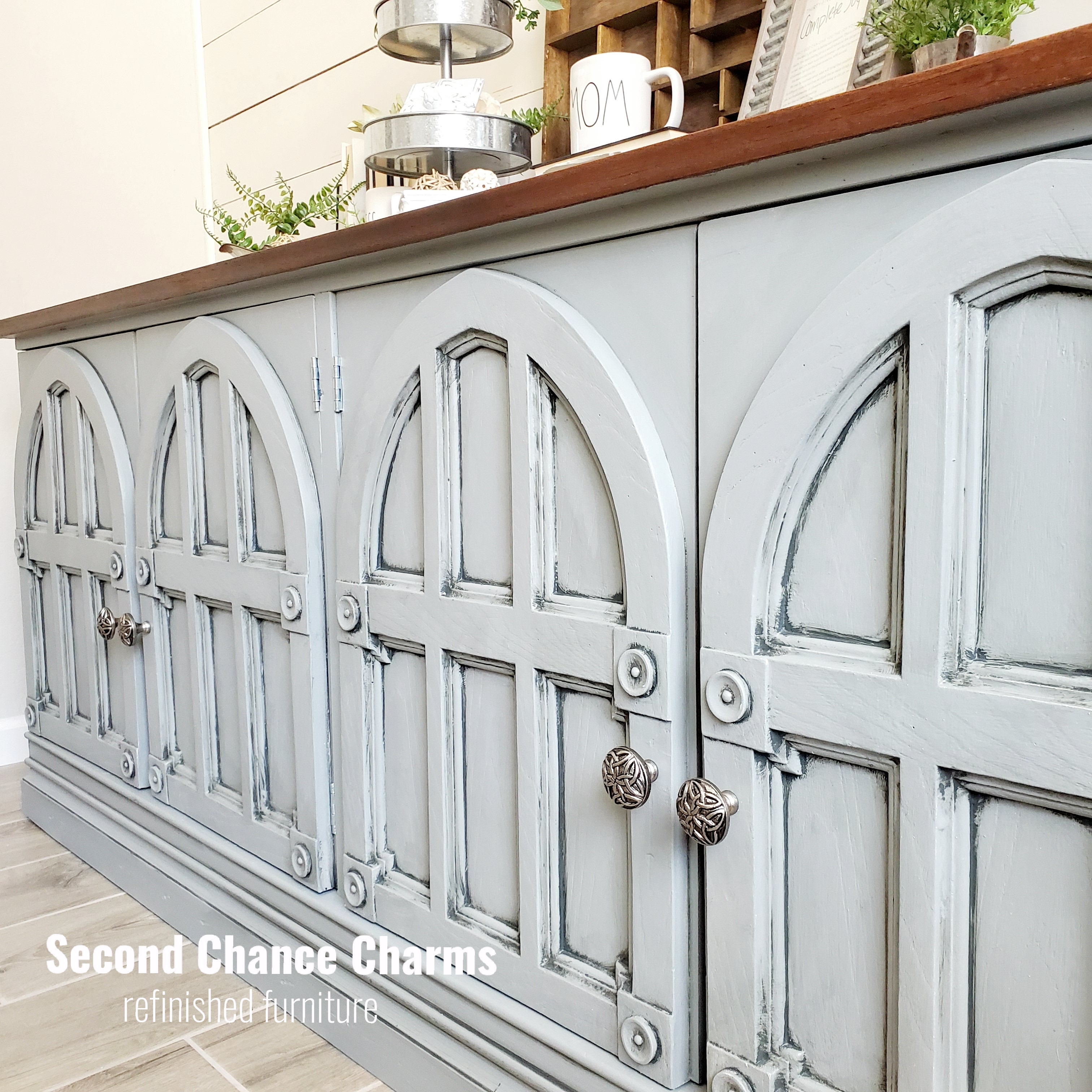
Refinished in Sherwin-Williams Anonymous and glazed in one shade darker using Porpoise. (The challenge in glazing one shade darker was I couldn’t tell how much of the glaze I was applying and taking off. When paint is wet its lighter. So during the glazing process I felt like I was reapplying the same base color. Talk about nervousness!) The top is stained using Varathane Wood Stain in Weathered Oak. The original hardware is cleaned up, however, the two long plates were more gold. In order to match them to the pulls I sprayed the two plates in Oil Rubbed Bronze and wet sanded them to bring a little gold out to match the existing pulls.

Before

Buffet by Collezione Europa

Love the curves of this piece! My client liked how it was originally but wanted to get rid of the flowers and have the stain be more of an espresso rather then a light brown.

I got my hands on General Finishes gel stain and knew this product would be my best bet on making this piece look stained without having to sand down the entire piece.

Painting the outside base in Sherwin-Williams Java for a wood color to give my gel stain a base to work with was the first step. I refinished the inside of the unit in Sherwin-Williams Tricorn Black per my clients request. Adding multiple layers of General Finishes gel stain in Java, building up layers, creating definition like wood grain was a fun process. Once cured I glazed the entire piece in Sherwin-Williams Tricorn black to darken the stain and to glaze in all of the nooks and crannies to make more of an impact in the lines.

My client is getting new knobs, but in the meantime I revamped the hinges in Black and left the original knobs for my staged photos.

Before:

Cathedral Media Buffet

Where do I start with this one!? At my clients color consultation she shared with me the interior decorations that were on order for her living room. Shades of blues, greys and browns. From a new couch, pillow shams, rugs and more, I recommended using Sherwin-Williams Tin Lizzie, a soft grey with a blue huge. Glazed in a dark grey using Rock Bottom which also has a complement huge to Tin Lizzie. I picked up these Nickel Celtic knobs from Hobby Lobby that caught my clients eye. Staining the top in Minwax Special Walnut completes his look! Not only is this handsome fellow large but super heavy with 6 large drawers inside the four cathedral like doors. Totally in love with him!

Before: